


Composing a Filmic Love Letter to Toronto’s Most Disadvantaged Area

Scarborough is Toronto’s most diverse area and, despite being home to more than 25% of the city’s population, it receives less than 1% of the hospital donations. As part of their attempts to raise $100 million, to help close the “healthcare gap” between Scarborough and other more-funded parts of Toronto, the Scarborough Health Network Foundation created the ‘Love, Scarborough’ campaign with Ogilvy Toronto.
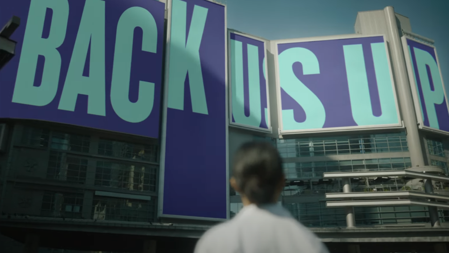
The campaign is both an open letter to the Toronto authorities and a love letter to the inhabitants of what director Scott Cudmore describes as this “very important community” in Toronto. Directing this launch film for the campaign, Scott Cudmore showcases the vibrant and diverse community of people that live in the area and uses the physical landmarks and locations to display some powerful statistics about the healthcare imbalance that is impacting Scarborough. Using a variety of impactful imagery, from projections onto buildings to banners on highway overpasses, Scott and the Revolver production team deliver a vital question: “When will we all be treated equally?”
Speaking with LBB’s Ben Conway, director Scott Cudmore discussed making a spot that raises awareness but feels honest, using physical messages with their own character and the importance of close-ups and peoples' faces in the film.
LBB> When and how did you get involved with the Love Scarborough campaign? Is it something that is close to your heart?
Scott> The project came to me through Ogilvy and agency producer Andrew Schultze, whom I had worked with before on another spot. Noah and Heather [at Ogilvy] really had the bones of the creative in place already by the time the project found its way to me. I changed a few of the scenarios around, but otherwise left the creative alone for the most part. When I went through it, I was very excited by it and wanted to get on board. Scarborough is an incredible community, so diverse and also so full of new Canadians and so it’s a very important community as well…and unfortunately one that is often ignored or even mocked by the downtown sector of the GTA. So I felt like more people need to be made aware of this issue.
LBB> How was the casting and location scouting process? What elements of Scarborough did you want to represent in the film?
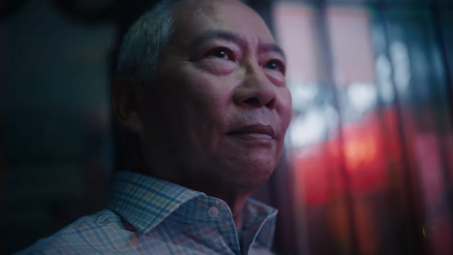
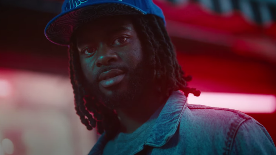
Scott> For me, the project was all about the people that we see in the film and less so about the locations. Scarborough is a super diverse community and so it was important that the casting reflect that. As for the locations, the messages that we were creating in each of the spaces was the most important thing, so the locations had to make sense for those messages and accommodate them physically. Beyond that, I just wanted it to feel honest.
LBB> There are lots of close-ups in the spot - especially of peoples’ faces - what was your intention with these shots?
Scott> I really wanted to feature people’s faces, so the close ups were really important and a big part of the design, using a lot of wider lenses right up close to peoples faces. There’s something immediate and direct about that approach that I really like, like you’re standing there with the person - you don’t get that same feeling from longer lenses. Again, my main line of thought in approaching this spot was the human story, so almost everything we did was in an effort to make the people the most important thing in each vignette, framed by the message they’re creating rather than the other way around.
LBB> You used the landscape of Scarborough as a background to display the spot’s messages - how did you plan and produce these shots? And why use physical messages over on-screen graphics?
Scott> There’s something more concrete and powerful about the messages actually physically being there than if they were just superimposed on the image, or elaborate VFX or something like that. When they’re actually real in the environment, they feel more permanent. If they were graphics superimposed they would feel too flimsy to me I think, too temporary. I don’t know if that makes sense, but it just has way more weight with them actually being there. Hope Little was the production designer on this and she did an amazing job with all of these, working with graphic designer Trevor Wheatley on a number of them, making sure that they all felt unique and different. Each one has its own character. And then it was just about selecting the right locations for them to exist in.
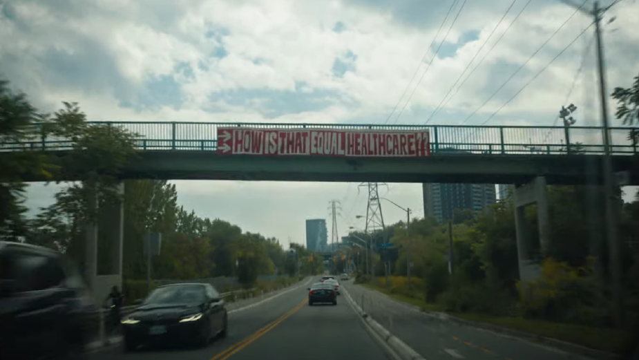
LBB> Getting the shot of the banner on the overpass whilst driving seems like a challenge - how did you capture this?
Scott> I think we knew it would be legible because it was a pretty big banner that Hope made. We did like four takes of that shot, mostly varying the speed at which we approached the overpass… making sure it was on screen for long enough to read it comfortably. But it’s all in-camera, there’s no VFX or anything.
LBB> Were you involved with the edit/post team? What directions did you give them?
Scott> Yeah, Izzy Ehrlich cut this spot beautifully and I really like working with her. I think the only real direction I gave her was to keep it as simple as possible - not a lot of cuts, only cut for impact. And, again, just to keep it about the people more than anything. They had to be the centre of it all, and I think she did that beautifully.


